Color Usage in Branding and Marketing
Thanks for joining us on our next discussion on color!
Now we all know that colors effect moods and emotions. They can trigger certain feelings when people encounter them. This makes it very important when selecting the right color or colors to go into your logo and identity.
But now we go a step further and say this: This can either make or break your brand.
WHATS YOUR STYLE?
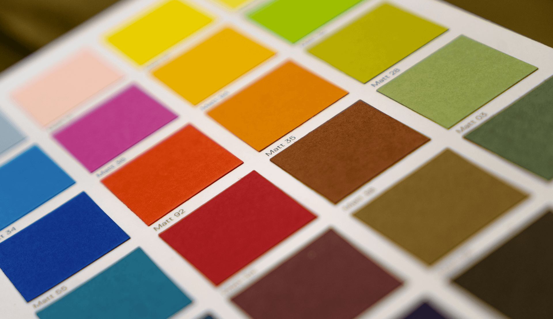
Hopefully, when you got a logo designed they also provided you with mood-boards and color palettes. (This is our standard operating procedure anyways). When you go to make a new sign or a new package for that new amazing product, you need to always make sure that it is the same color that you were using. And no, we aren’t saying “Keep it purple,” we are saying “Keep it 29:C, 52:M, 0:Y, 33:K.” Trust us, people can tell when the color is a little bit off. This is why designers get paid as much as they do for big companies like McDonalds and Starbucks. Not only does it look nice, but little things like this help with customer trust.
The important thing to remember is that you are not forever doomed to use the same color. There are several ways to expand and utilize more or even adapt.
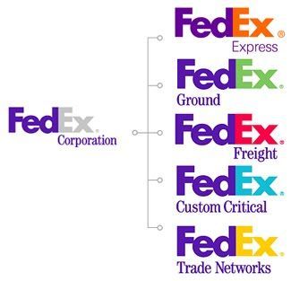
There are cases where the company logo has a series of colors that are used to distinguish multiple different facets of the company’s services. It is tricky because you have to balance the highly adaptive with remaining consistent and familiar. This example is brought to life perfectly in the FedEx logo.


MAYBE YOU FEEL THE OPPOSITE WAY?
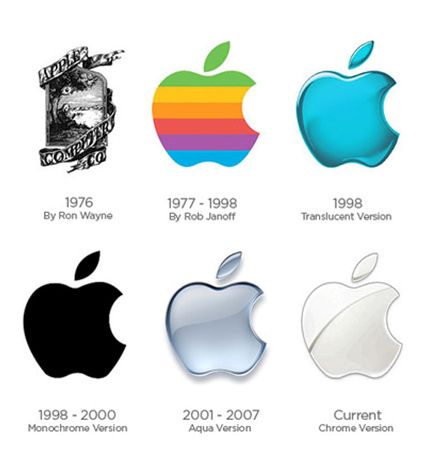
Good news: Some companies expand into other colors through logo updates, or decide to be rid of them altogether. This is a good choice for companies who are seeking a sleek minimalist look. Consistency is key but you don’t want to appear dated and stuck.
Color in brands is important when it comes to marketing and advertising as well. Some campaigns are based solely on a color like (RED). Remember your audience when marketing. Based on the gender of your audience, you might want one color over another. Use monochromatic for online ads, complimentary for more print media or to get more variety, and tri-colored ads to add sophistication and bold effect.
COLOR DOESN’T JUST PUT A PRETTY POP IN YOUR BRAND.
Wisely utilizing colors encourages reading by 80%. Not only that, but those readers will remember the material better! It draws the eye, enabling you to highlight key information and reinforce ideas. This is a good tactic for websites and layout design for when you just have a little too much copy. It helps to break it up and add some interest. Make sure to use colors that work with the brand color or that exist in the brand color palette. If that doesn’t work, it is also possible to theme your content (like a blog post) and make it specific to one color. But you have to keep that idea going and not leave an oddball standing alone. I guess thats the most important part – Commit to your idea and your vision.
We believe in intuitive design so we understand if you feel that in your gut something is right for your brand. If you have the option, always consult with a professional designer to ensure that your content and your marketing is clean, professional, and elevates your brand.
CREATING A SYSTEM
There are several ways to use a color in your brand, as we’ve said. There is a whole system that needs to be built and guidelines in place on the usage within your brand. Icons can be built to highlight statistics on a webpage or in a pamphlet, signage in your physical store can utilize your selected color or colors. Maybe your employees all have that same color of shoes?
We don’t want to stray off topic into clothing, but if you are curious about this, Google Starbuck’s employee dress code!
It’s far more complex than selecting a color and then plastering it all over the place. Luckily, there are experts in the field, ready to help!
Beautify Your Brand, Attract Customers.
Interested? Reach out today!
Email us: he***@*******gn.com or call (916) 581-1777
