- Research
- Positioning
- Messaging
- Logo Design
- Illustration
- Brand Guidelines
- Web Design & Development
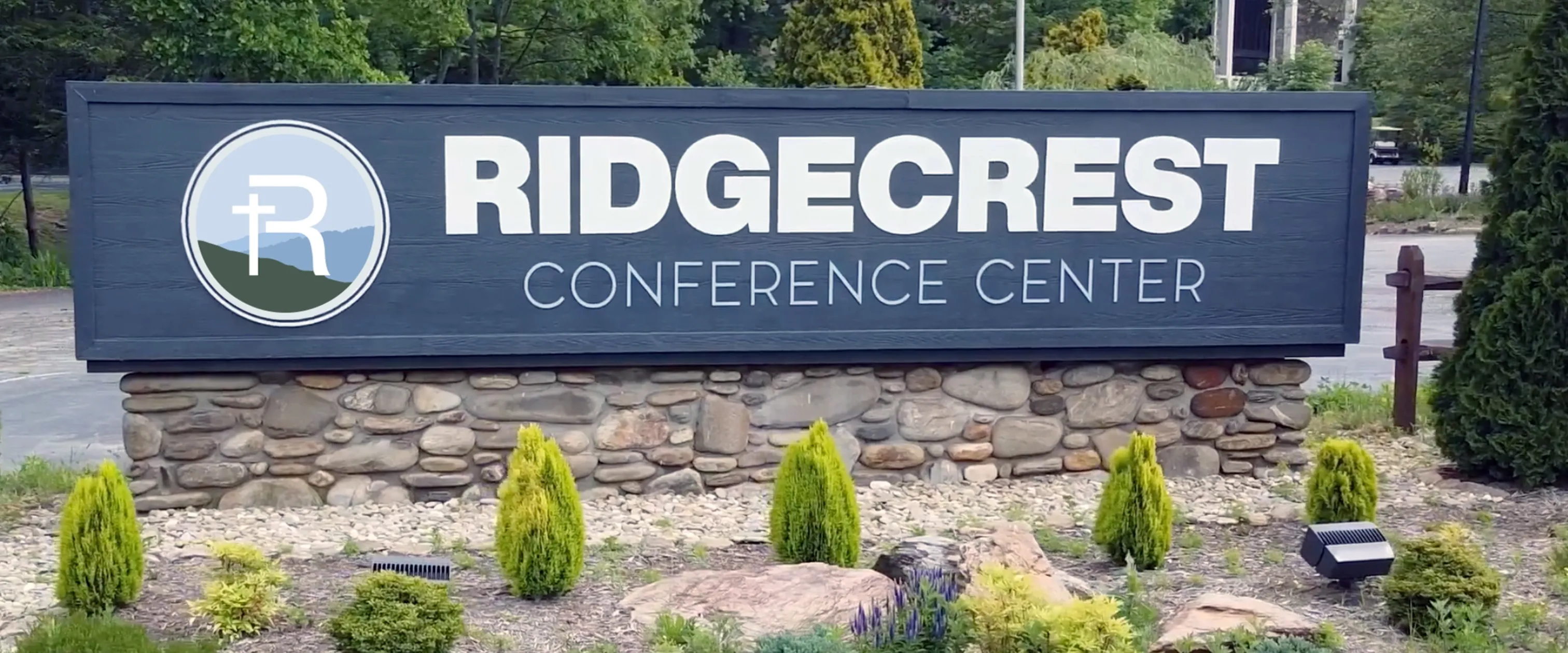
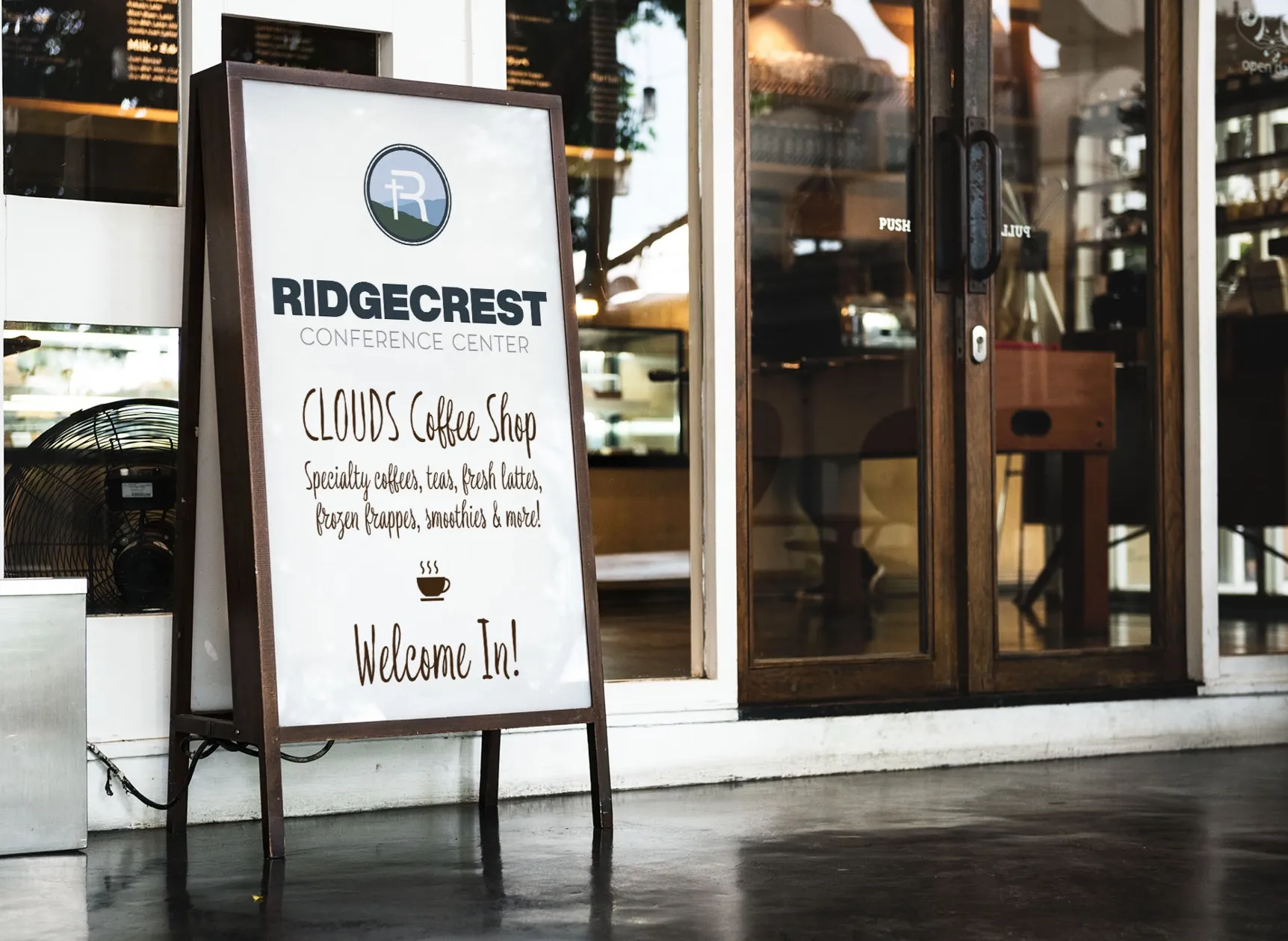
- Environmental Signage
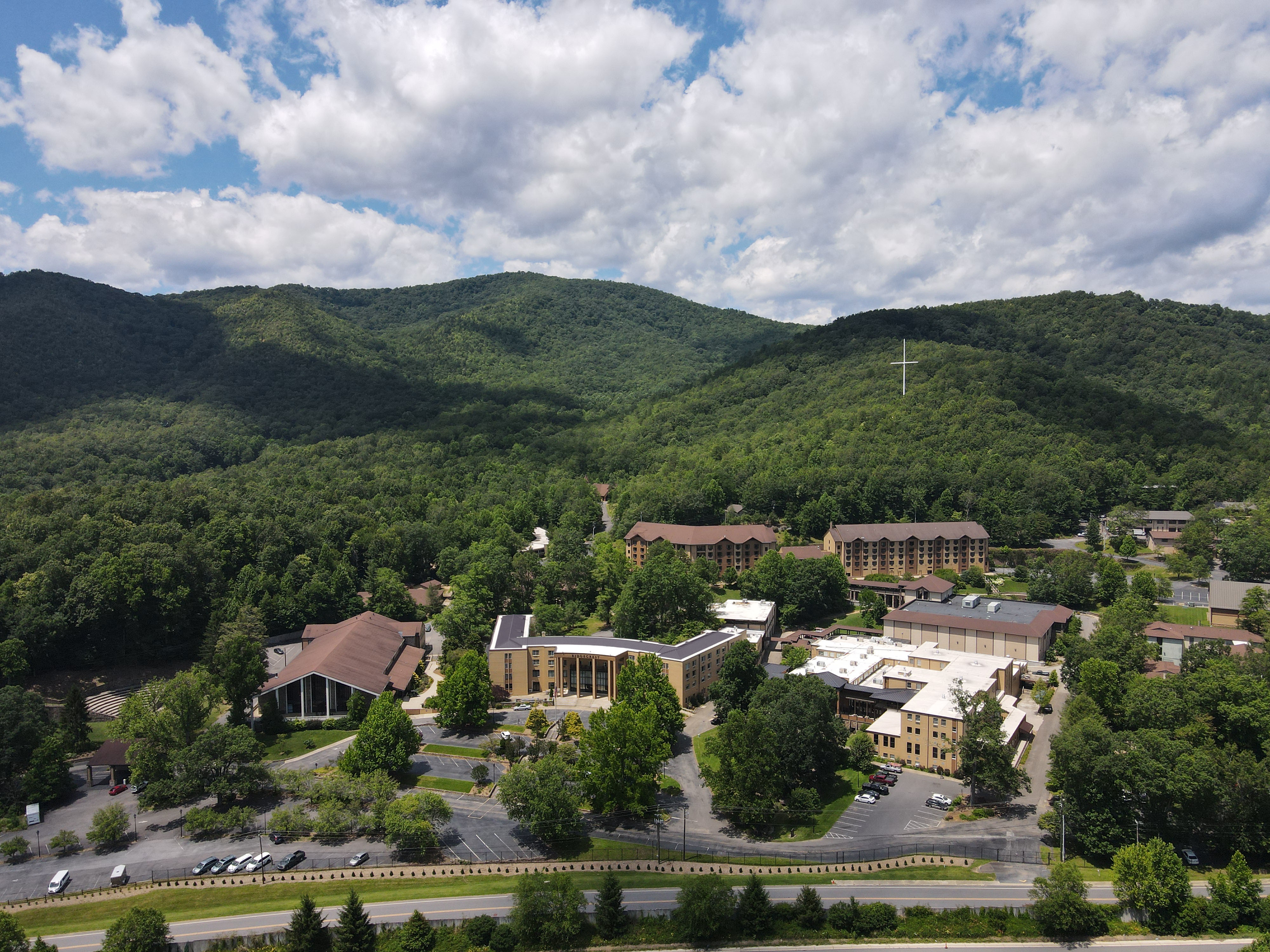
Ridgecrest Conference Center, a century-old organization with a rich legacy in the Blue Ridge Mountains, needed a transformation to resonate with today’s audience. Their marketing team recognized that the longstanding logo and outdated website no longer reflected their vibrant mission and vision.
Ridgecrest sought our expertise to revitalize the brand. Our journey began with defining their brand strategy and positioning, followed by the creation of a contemporary brand identity and a sleek and intuitive digital platform.
This collaboration was not just about updating their look; it was about honoring Ridgecrest’s storied past while propelling them into the 21st century.
Crafting a memorable brand experience begins with strategic insight. We initiated brand strategy workshops with the Ridgecrest team to shape their unique brand narrative—delving into their identity, their target audience, and how they all interconnect within the brand's framework.
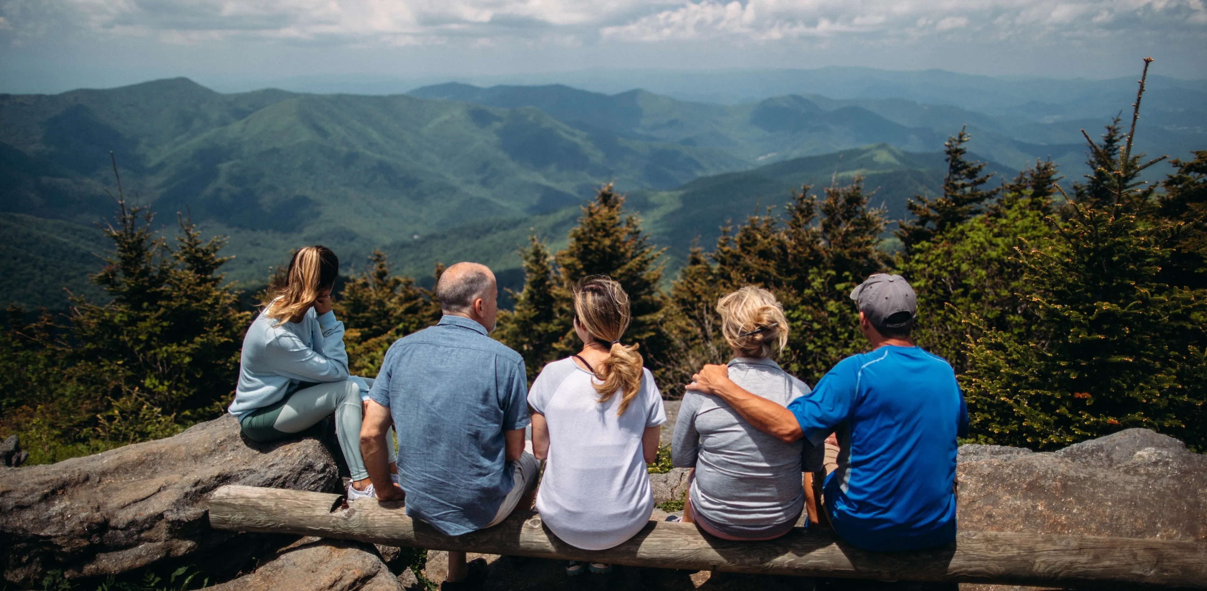
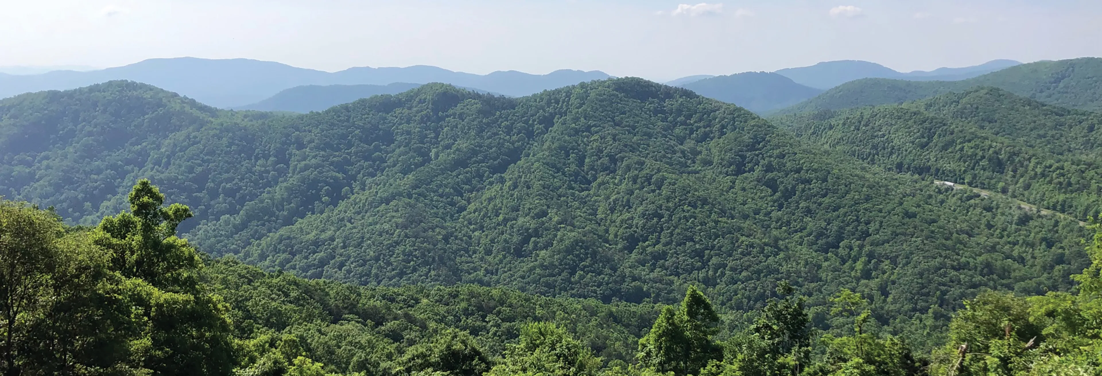
Understanding the needs of Ridgecrest’s diverse audience—guests, event planners, and special events organizers—was essential in establishing meaningful brand touchpoints. Through immersive exercises, we gained deep insights into the Ridgecrest community and aligned their needs with the core values and identity of the brand. This process led us to position Ridgecrest as a beacon of hospitality and spiritual retreat, embodying their commitment to providing transformative experiences amidst the serene backdrop of the Blue Ridge Mountains.
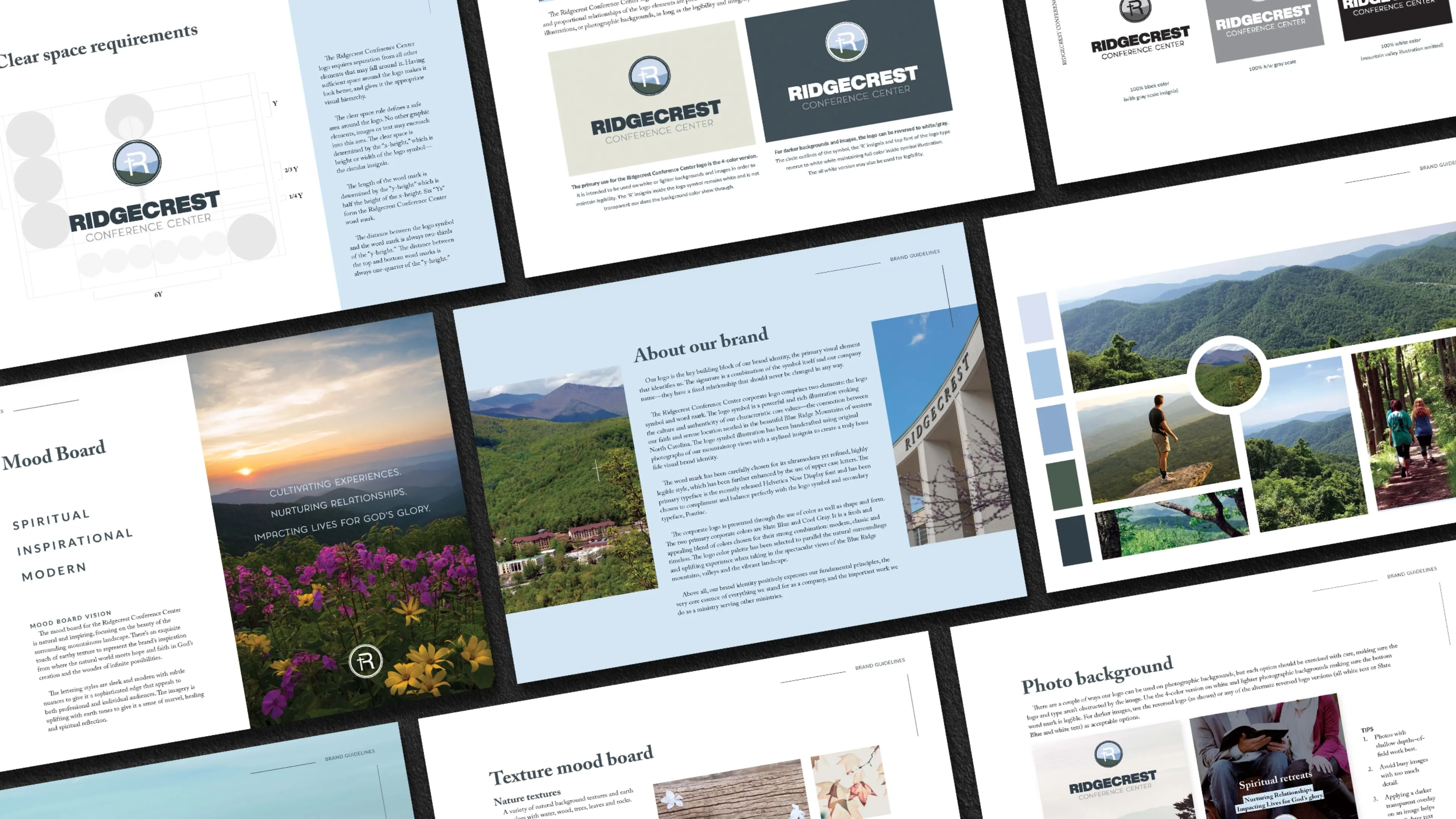
Inspired by the picturesque surroundings of the Blue Ridge Mountains, we carefully curated Ridgecrest’s brand colors. Building upon their new logo design, we selected their primary and secondary brand colors, as well as an extended color palette for their website and brand marketing. These thoughtfully chosen hues are highlighted in various graphic elements and designs, adding richness and warmth to their visual identity, while maintaining a cohesive and welcoming look.
PRIMARY BRAND COLORS
-
slate blue
-
cool gray 7
-
valley green
-
valley blue
-
haze blue
-
sky blue
EXTENDED COLOR PALETTE
-
blueberry
-
sage leaf
-
hydrangea
-
asian pear
-
almond
-
faded sun
-
sunset coral
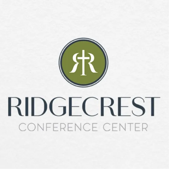
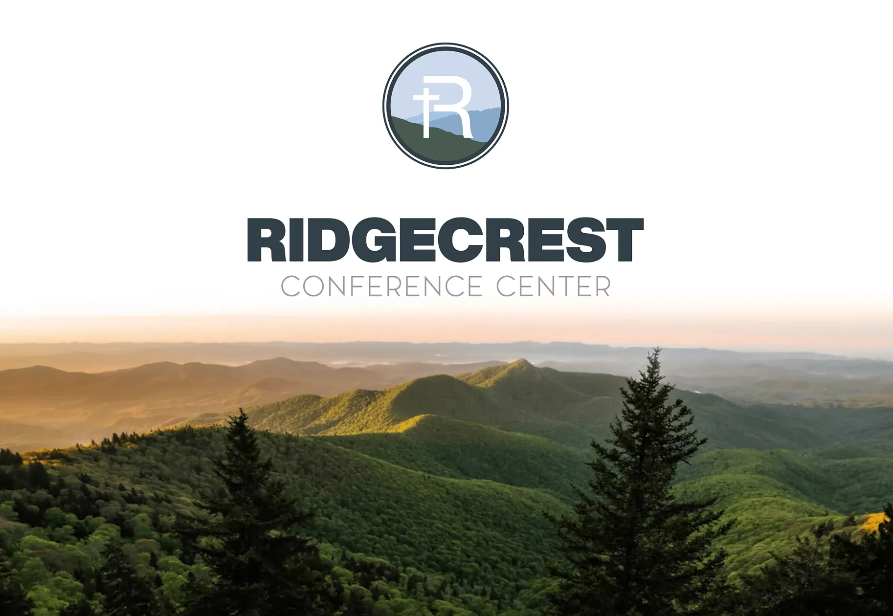
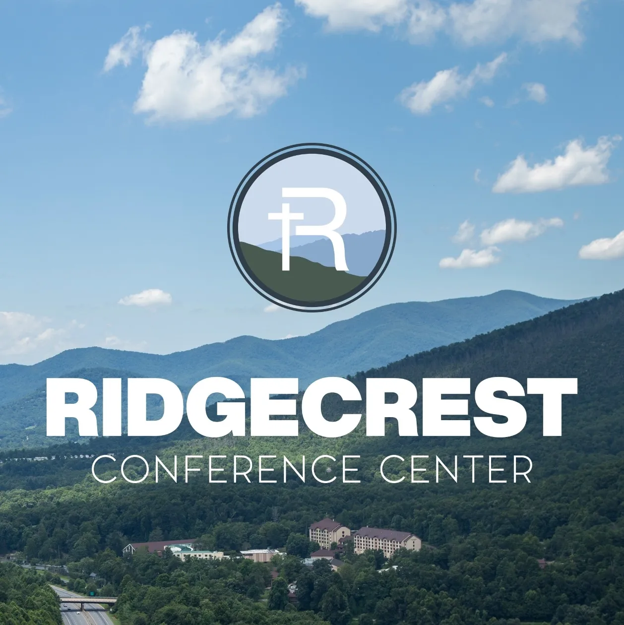
LOGO DESIGN INSPIRATION
For Ridgecrest, we aimed to capture the essence of their serene mountain setting and spiritual mission in each logo option. We presented six design options, each reflecting key brand attributes: timeless, inviting, and reflective of their heritage.
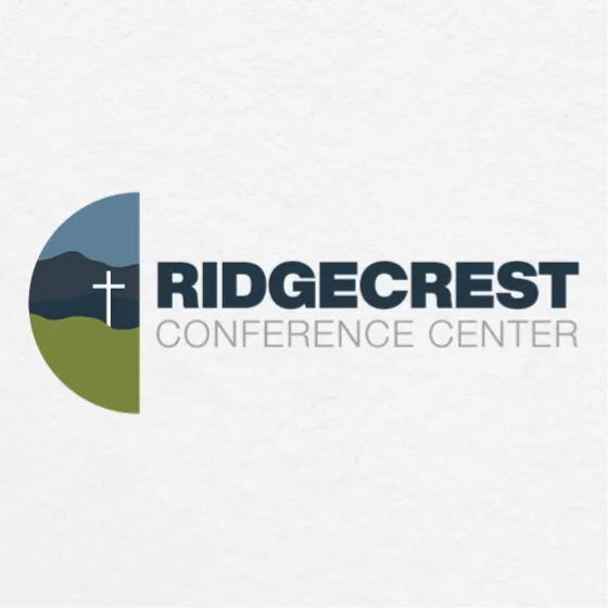
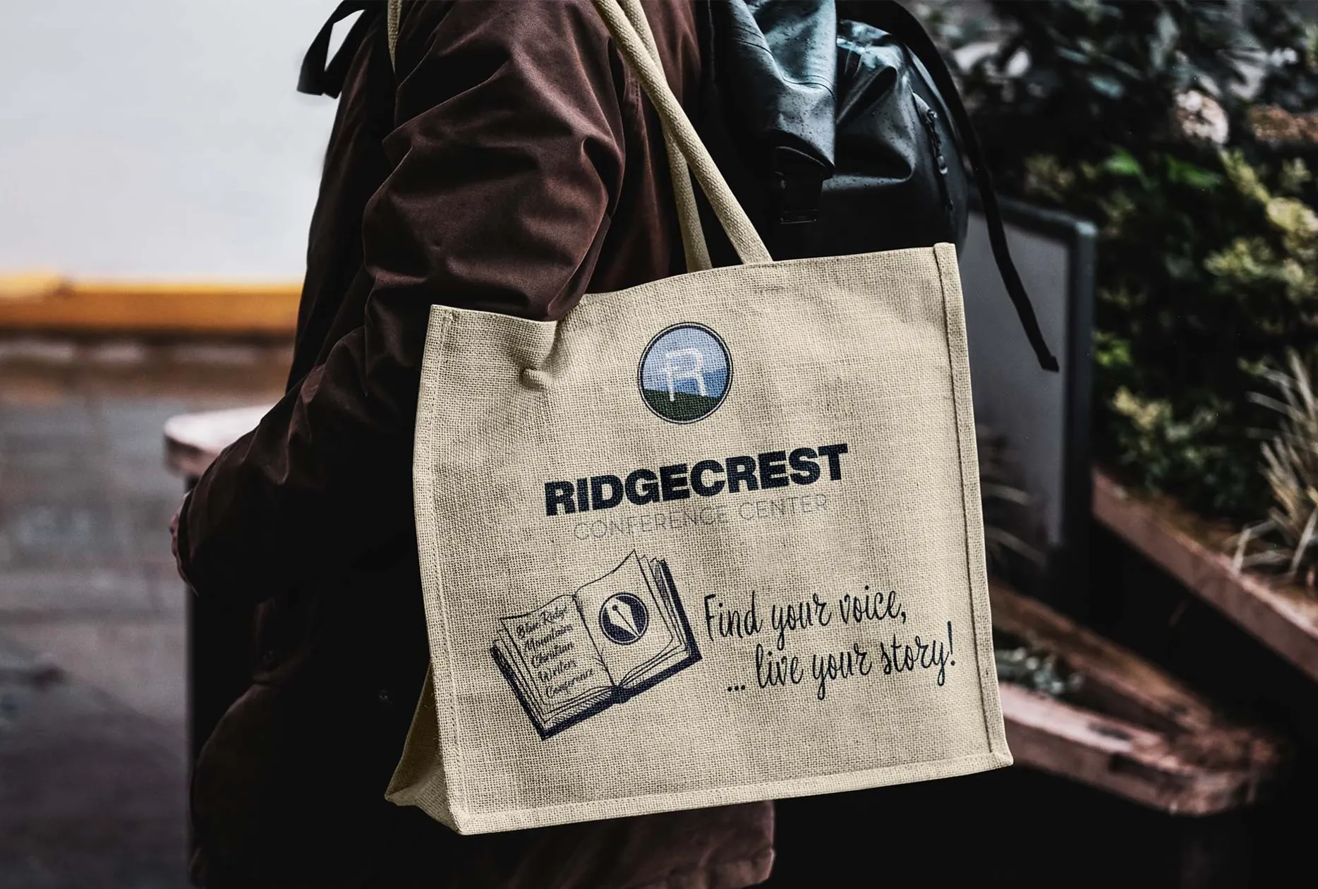
The final choice was influenced by the Ridgecrest team’s preference for a particular font treatment, which we then refined to meet their vision. By incorporating the iconic cross atop the mountain into the “R” and featuring the valley view of the Blue Ridge Mountains, we created a stunning logo that beautifully represents Ridgecrest’s legacy and mission.
THE DESIGN CONCEPTS
Old Logo
-
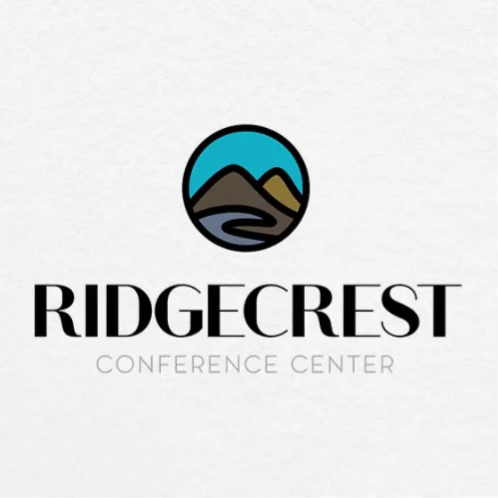
Logo Option 1
-
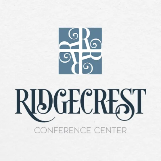
Logo Option 2
-
Logo Option 3
-
Logo Option 4
-
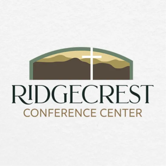
Logo Option 5
-
Logo Option 6
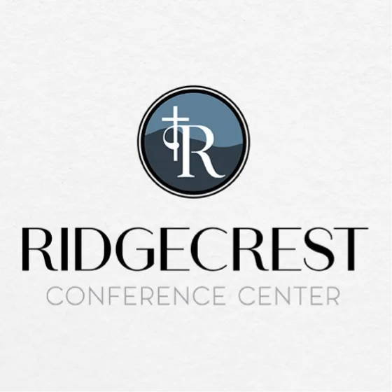
ALTERNATE ICON ART
ALTERNATE INSIGNIAS
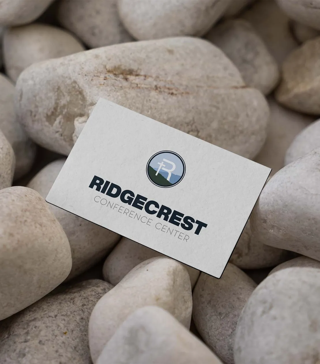
THE FINAL LOGO
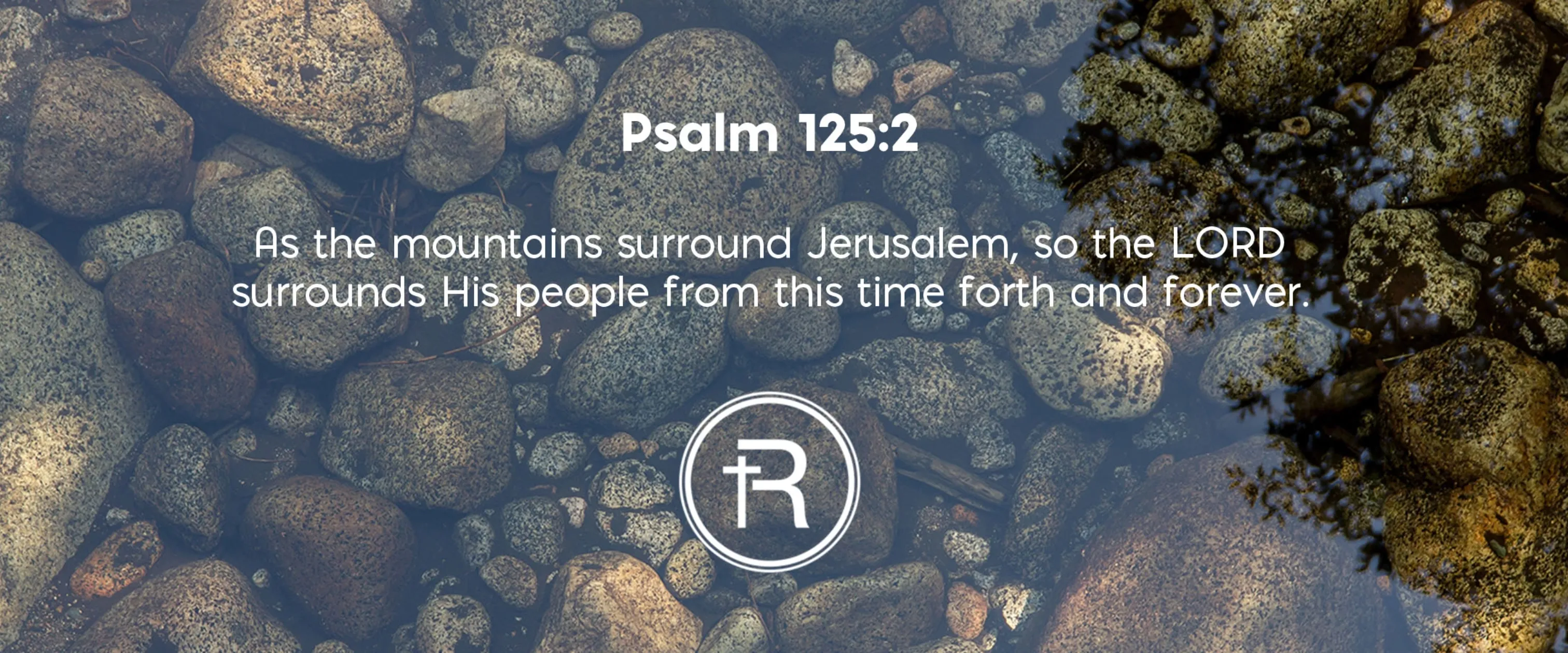
LOGO SYSTEM IN USE
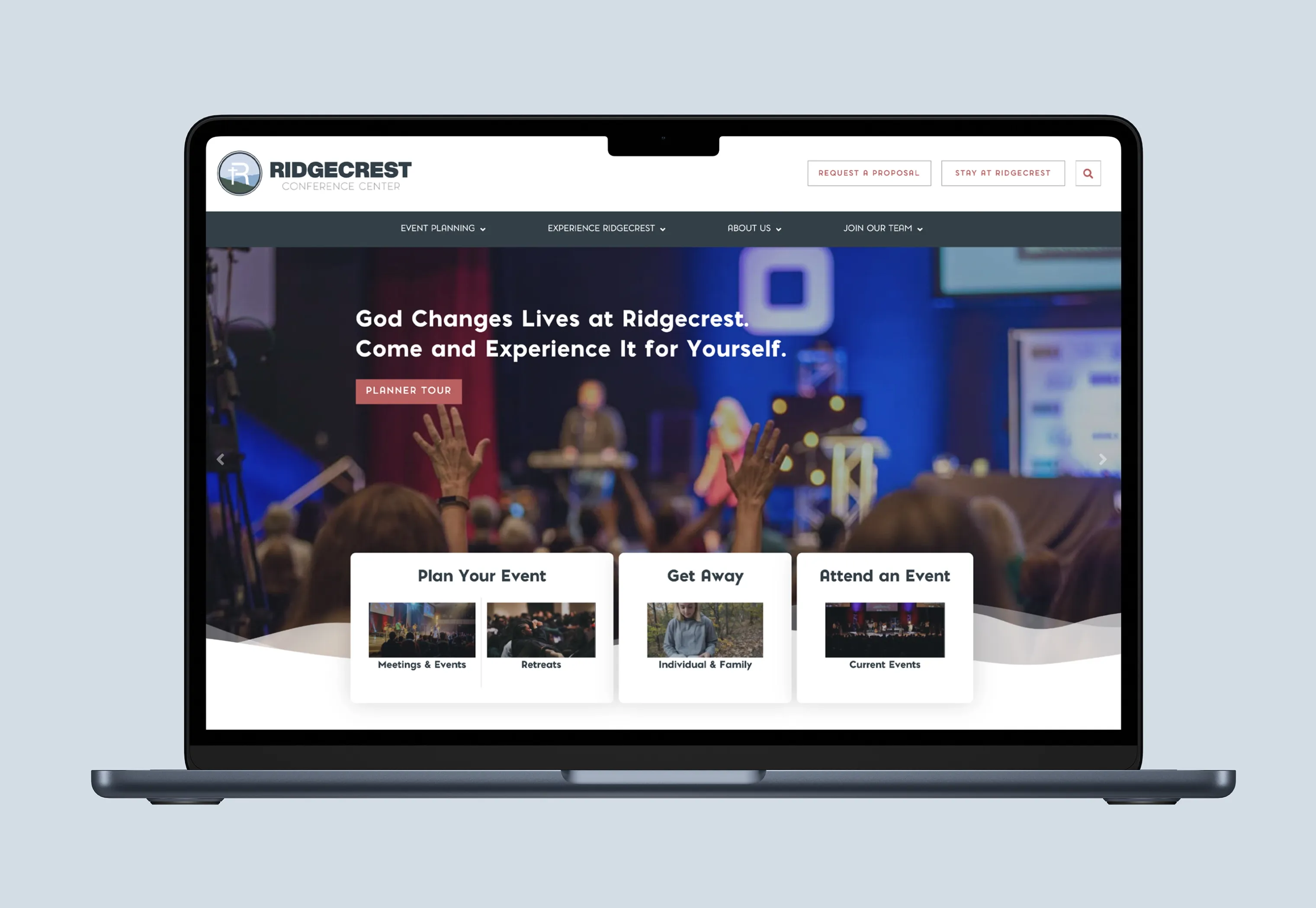
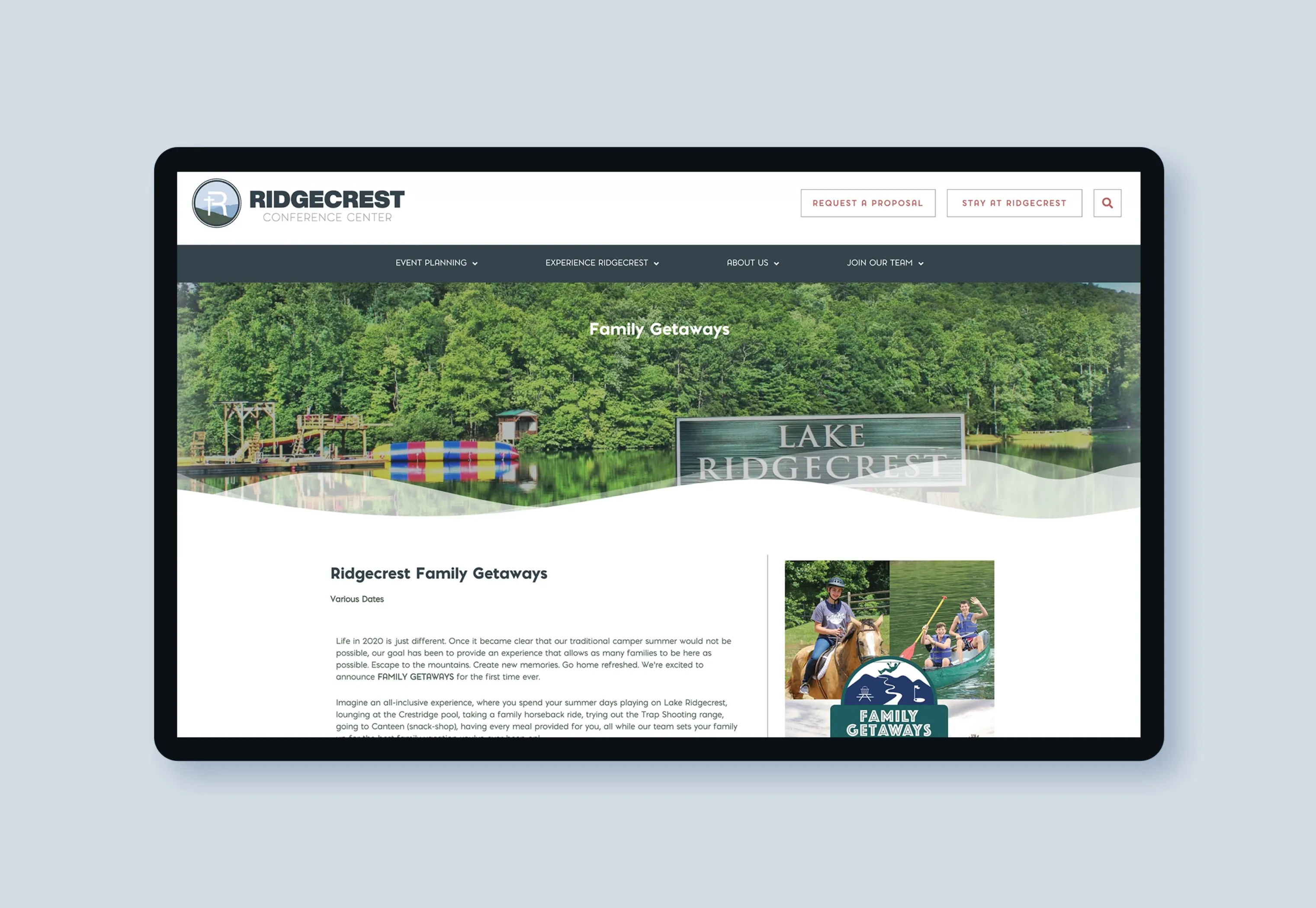
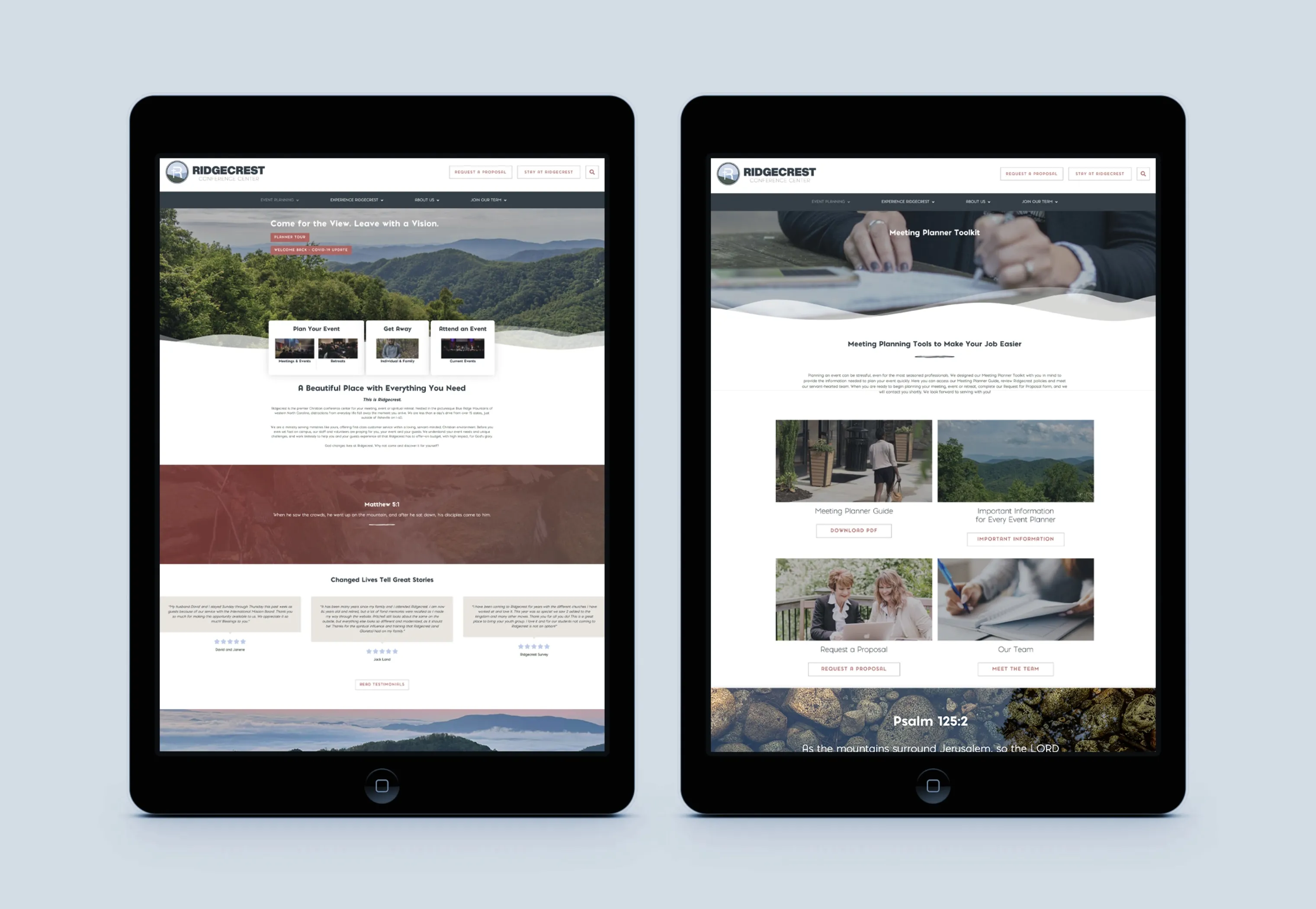
Ridgecrest Conference Center’s previous website struggled to reflect its rich history and vibrant mission. Outdated visuals and a cumbersome user experience created barriers for planners, ministers, and families seeking meaningful connections. We set out to create a digital platform that honored Ridgecrest’s heritage while providing a modern, intuitive experience tailored to its audience
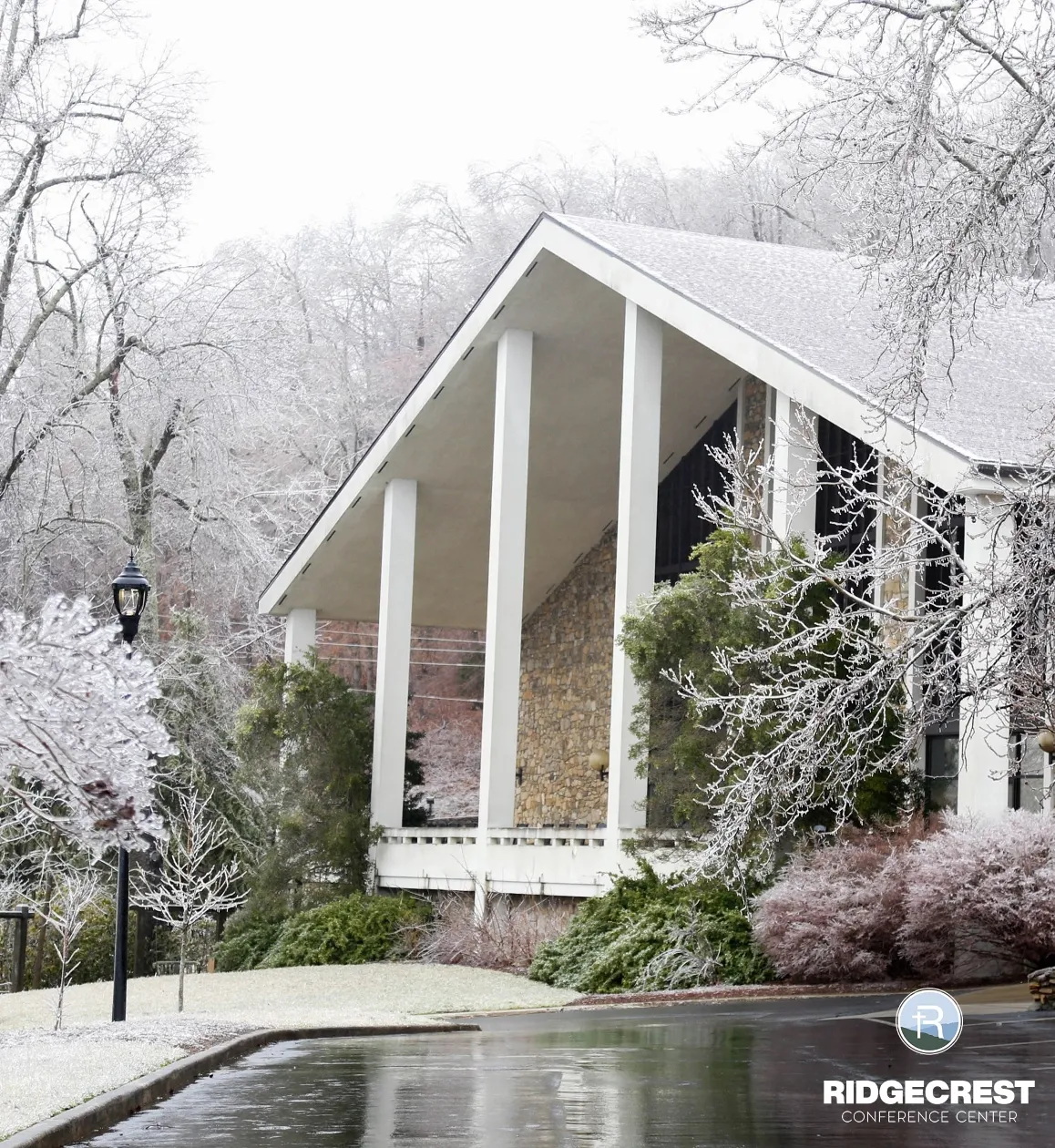
Building on the refreshed brand strategy, we crafted a visually striking and user-centric website that balanced legacy with innovation. From serene, mountain-inspired graphics to streamlined navigation, every detail was designed to reflect Ridgecrest’s identity while simplifying the user journey for booking venues, planning retreats, and exploring family getaways.
The result was a thoughtfully designed, scalable website that elevated Ridgecrest’s online presence, showcasing its picturesque location and mission to create transformative experiences. While the website continues to evolve, our work laid a solid foundation, aligning design, functionality, and strategy to ensure Ridgecrest remains a beacon for its community.
“Ridgecrest has always been a place of connection, reflection, and transformation, and 829 DESIGN helped us bring that spirit to life online. Their team took the time to understand our history, mission, and audience, and it showed in every aspect of the final result.
The thoughtful branding and web design honored our rich legacy while creating a modern platform that truly connects with event planners, churches, ministers, and families. The logo design, in particular, is truly remarkable—expertly capturing the essence of the Blue Ridge Mountains. It perfectly mirrors our mountainous landscape, with the iconic cross atop the peak symbolizing both our spiritual mission and natural surroundings.
From the seamless user experience to the design details inspired by our heritage, their work exceeded our expectations and positioned us for future growth. We’re incredibly grateful for our new look and their partnership.”
Shared by the Ridgecrest Leadership Team